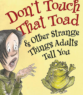
When it comes to children's book covers there are various different ways of going about designing them. I've chosen a few varieties to see what sort of thing fits into the current children's market.
This cover incorporates large text and the title character. It's easy to understand and self explanatory. It also uses bight primary colours which makes it aesthetically pleasing and child friendly.
In this cover, the image is central and the type is slightly more oriental. I don't think it's as clear to read and if you didn't know what the book was about, i'm not sure it's a very good representation.
In this cover, the type has been placed inside the image. I quite like the idea of using imagery to frame the text, it's a good use of text and quite a clever idea.
The text looks quite crowded here, and the colour is almost too bright. However, I would know what it was about as little red riding hood and the big bad wolf are very recognisable characters. It is also quite lively and friendly and I think children would like it.
I really like this cover, I think it works really well. The colours are nice to look at, the image is very playful and very suggestive. It's intriguing and I want to read it. I like the use of really simple type - overall I think it's really successful.
This is a nice simple cover design. It's self explanatory, the type is clear and I like the colour scheme that has been chosen. My criticism would be that it doesn't necessarily brand itself well as a children's book. It's not very playful and the colours are quite bland.
I like this cover a lot. It stands out because of the bold use of colour, the quirky illustrations and the positioning of type along the top and the bottom. I think it's a really successful design.
I also think this cover is quite clever. Making the type and the lollipop read is a good design decision and the positioning of the lollipop has been well thought out and it really quite clever. I like the angling of the type, it fits well with the imagery.
I think this has too much type, it looks over crowded and doesn't fit well on the page. I like the illustrations but I think they should take priority over the text and not the other way round.


No comments:
Post a Comment